

Being unusually distinctive and blunt with wine labels
There’s one particular example of how to use color labels to make a distinctive impression.
Where the finest products along with everything you need for “do-it-yourself” label printing are just a click away.
Call Now: +1-866-299-0066 or Live Chat

Businesses that produce and sell consumer products often struggle to develop eye-catching labels that will stand out on retail shelves, but creating a unique visual design doesn’t have to be overly complicated. In fact, the key to effective label design is quite simple: build upon your existing brand and style preferences.
The truth is there is no universal color scheme or layout that will ensure customers choose your products over the competition. That said, there are a variety of techniques that can help you tap into the subconscious mind of customers, grab their attention and stimulate interest in your products. Here are 3 useful tips for creating a one-of-a-kind product label:
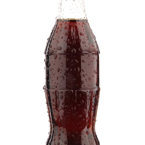
While most companies will want to incorporate color schemes that match their logos and promotional materials, being strategic about your palette can have a profound effect. According to the marketing firm Iconic Fox, a company’s choice of color can have a significant impact on how its brand is perceived and how customers will physically respond to a piece of advertising collateral. For example, the color red can increase an individual’s heart rate, raise their blood pressure and stimulate their metabolism and appetite, according to Psychologist World. This likely accounts for why many food brands incorporate red hues into their marketing and labeling strategies.
The best color palette for your labels is heavily dependent on your target audience, your brand identity and the type of products you sell. In some cases, a minimalist approach may be the most effective option, as a plain black-and-white label can communicate simplicity, luxury and sophistication. Once you’ve selected a primary color, the next step is to introduce contrast through complementary colors. If your label has a blue background, you should consider incorporating shades of yellow to make your logo, brand name and label content stand out.

Similar to color scheme, your choice of font can have a major impact on the appeal of your product labels; it can also make it easier (or more difficult) for consumers to understand the information listed on your labels and packaging. While using a decorative font may be perfect for your brand or the name of your products, it can make the body copy near impossible to read. That’s why a basic sans or san-serif font is usually the best option for slogans, disclaimers, company bios and other supplemental information. These include options like Times New Roman, Arial, Futura and Proxima Nova, among others.
As pointed out by Scribe Consulting, serif fonts typically have more distinct individual letters, which makes it easier for our brains to quickly recognize them. That said, choosing a sans-serif font can add a feeling of simplicity that may appeal to the sentiments of modern consumers. In terms of company branding and product names, the font you select should invoke a specific emotion in your readers. For example, a classic, narrow font with curves and loops can communicate elegance and old-world charm, whereas handwritten alternatives are more personal and inviting.
While font plays a significant role in the reliability of product labels, layout design is perhaps the most important factor in creating engaging and legible copy. Trying to stuff too much information into a small area can make it extremely difficult for consumers to read about your products, which is why most design experts recommend introducing white space into the equation. According to one study by Microsoft and the Massachusetts Institute of Technology, consumers who read content with a natural layout felt more focused and had a clearer sense of the intended meaning.
In the most basic sense, good layout design is all about capitalizing on how the human eye and mind process information. Rather than using long blocks of text, you should try to keep lines of copy between 7 and 9 words to prevent overexertion and comprehension issues, according to SlideTeam. Additionally, U.S. consumers’ eyes are instinctively drawn to the top left corner of pages and product labels, which should give you some ideas about where to place your logo and product name. Ultimately, the perfect layout for your label depends on the type of container or packaging you’re using and the amount of information you plan to include.
Designing an eye-catching label can be challenging, especially if you don’t have the right tools at your disposal. Make sure you have the design and printing infrastructure you need by visiting DuraFast’s U.S. store or Canada page.
There’s one particular example of how to use color labels to make a distinctive impression.
Your brand signatures should carry your products through the long haul.

More liquor and beer companies are employing smart, interactive labeling technology to create an experience with their brands.

The Senate will consider a compromise bill on GMO labeling regulation.