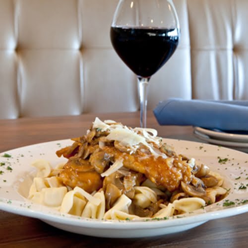
While many companies have existing brand colors that define every label, if your firm is looking to launch a new imprint or product line in 2015, it’s important to consider color trends in the advertising world. Last month, the world’s foremost authority on color, Pantone, announced “Marsala” as its color of the year.
Presented as a kind of dark red that echoes the color of marsala wine sauce, the deep, warm hue seems perfect for industries like food, interior design and apparel. While critics are divided as usual over the selection, it’s a shade that’s bound to show up on fashion runways and department store shelves. On this blog we’ve discussed the importance of developing striking, appealing wine labels, and Marsala could be exactly the color you’re looking for in 2015 to capture attention with custom label printing.
“An earthy shade with a bit of sophistication, texture is the story in print and packaging,” explains the Pantone blog. “A matte finish highlights Marsala’s organic nature while adding a sheen conveys a completely different message of glamour and luxury.”
The company also cited the color’s appeal to both men and women. For industries without a clear gender market, using shades in the Marsala family can reach a broad spectrum of audiences in a way that is approachable. Last year’s “Radiant Orchid” shade brought purples to the forefront of branding strategy, though perhaps to the detriment of male consumers.
Like many advertising elements, color works subliminally. People who consider purchasing your products might not know why they’re drawn to a label color, as trends are reinforced over time through a variety of retail experiences.

