
How proper labels can ease residents’ fears
When companies invest in a label printer such as an Epson GP-C831, they ensure that all employees are able to read and understand what is inside a container.
Where the finest products along with everything you need for “do-it-yourself” label printing are just a click away.
Call Now: +1-866-299-0066 or Live Chat
To paraphrase the savvy (albeit fictional) ad man Don Draper from “Mad Men,” there are often opportunities in which packaging and labeling can engage consumers in a way that goes deeper than flash – or, in the specific context of consumer packaged goods, shelf appeal. If this connection between customer and product (and brand, by extension) is successfully forged, it can all but guarantee faithfulness to a company that lasts for years, decades or even a lifetime!
Packaging and labeling can engage consumers in a way that goes deeper than flash.
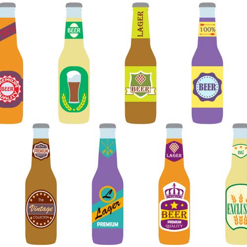
Yet there are even greater things that exemplary, iconic and meaningful labeling can achieve. Some of the most interesting examples of craft beer packaging devised by microbrewery designers that have rolled through label printers and onto store shelves in the past few weeks are not only aesthetically appealing: A few intend nothing less than to serve the greater good of equality.
The phrase “less is more” became a cliche for a reason – there’s often a fair amount of truth to it. In a recent piece dedicated to intriguing beer labels, Paste magazine paid particular attention to brewers whose label and packaging designers embrace a minimalist philosophy.
Maine Beer Company hardly includes any graphics whatsoever on its bottles: The brewery’s beer labels feature the company name and location (Freeport, Maine) with a small black-and-white illustration of a grain stalk between them, followed by the beer’s name (usually with little flair to it beyond some outlandish lettering or a small illustration) and then basic specs on the bottom. In between, it’s mostly white space. The simplicity itself is what intrigues the eye. It makes one wonder why the product feels no need to advertise itself – and thus positively anticipate the quality of the adult beverage within the bottle.
Other beers cited in the Paste piece don’t take minimalism as far but still exemplify the power of doing more with less. Emergency Drinking Beer, a lighter pilsner style from the Georgia brewery Wild Heaven, uses a bright yellow background and black all-caps lettering to create the impression of industrial safety signage and reinforce the casual nature of the ale. Similarly, Fullsteam Beer uses basic geometric shapes with a plain font on a silver background for a futuristic look.

Other breweries take the opposite approach from minimalism and adorn their bottles and cans with bold, eye-catching and sometimes absurdist art. The Colorado-based Boulder Beer Company, for example, recently updated its branding overall, and according to Brewbound, they did so with an emphasis on bright psychedelic colors. Beers like Pulp Fusion and Mojo will have particularly outre art with their blends of orange, purple and yellow, set to roll out in June 2018. Others, like Buffalo Gold, don’t have wild hue combinations but will still capture a would-be drinker’s attention with their strong designs, such as the mystical-looking buffalo on the golden ale after which it’s named.
Jeff Brown, the brewery’s president, cited the market’s fierce competition as a primary reason for the rebranding, but also brought up a genuine desire to inject greater creativity into all aspects of Boulder’s beer production.
“As we launched into this refresh project it was critical to us that our brand maintained its Colorado roots while giving us a more creative canvas to connect with our consumers,” Brown told Brewbound. “We’ve been crafting beer and fun longer than just about any craft brewer, and our new graphics along with new styles represent that continuing evolution.”
Issues of gender-based disparity in pay, workplace sexual abuse or harassment and other matters of women’s rights came into stark relief during 2017, due in large part to the #MeToo movement. BrewDog, a U.K.-based microbrewery famous for both its strong ales and bold packaging, decided to use its platform within the craft beer market to do some good for its women customers. According to Forbes, its 47 branded bars started offering a pink-labeled version of its Punk IPA on International Women’s Day – March 8, 2018. This is intended as a pointed parody of past attempts by breweries to appeal to ladies who love beer, most of which resort to employing stereotypically feminine colors and design. (The labels of “Pink IPA” feature statements like “Beer for girls.”)
The campaign has more behind it than satire, however. At the BrewDog bars, women paid 20 percent less for Pink IPA during March, and the company donated 20 percent of total sales to charities with gender equality as their primary aim during the same period of time. Though the “Pink IPA” branding received some criticism, it largely earned praise due to the commitment of the brewery to aiding genuinely charitable work.
When companies invest in a label printer such as an Epson GP-C831, they ensure that all employees are able to read and understand what is inside a container.

Whether a company is manufacturing food, pieces of medical equipment or even hazardous chemicals, durable labels that adhere to federal requirements are crucial to customer safety and a business’ longevity.

As more and more new breweries compete for attention on shelves, it can often come down to who has the most eye-catching and attractive label.

What happens when long-running disputes in global politics make their presence felt in the retail sector?